Thursday, December 15, 2005
In Case You Were Wondering...
People Really Need to "Lighten" Up
Some people are up in arms about this holiday display. I think it's pretty funny and as close to a true artistic statement as Christmas lights can approach.


Some important points to make:
1. I say the above and I STILL am an animal lover.
2. Rudolph is a fictitious and at best, cartoon character.
3. They are fake deer made from lights.
Just my two cents.
Wednesday, December 14, 2005
Of Penguins and Men
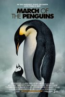 This past weekend, I watched "March of the Penguins." I am often accused of anthropomorphizing animals by those who think animals are all reflexes and biological instincts with no consciousness or feelings. I don't know how someone with such beliefs could continue to believe in such a way after seeing the film. It is clear that animals feel and have fealty, express loyalty, and experience grief and pain. The story of the mating ritual of these emperor penguins makes these realities abundantly clear--whether you see a penguin show tendernous and commitment to another penguin and their offspring, or whether you see the penguins who survive the arduous journey stand (sadly) over one of their fallen comrades or young, or watch a bereaved mother penguin actually try to steal another's young. Some animals are really no different than us, even though they can't grasp with a thumb and use tools or verbally express themselves through human languages. Perhaps those things aren't important in the end anyway if we are all the same at the core. I highly recommend the film. It was amazing, educational, and touching.
Sunday, December 11, 2005
I Blame "Timer"

Saturday, December 10, 2005
Friday, December 09, 2005
Revisiting an Old Favorite: Cat Wranglin'
Chivalry Isn't Dead
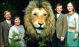
 1979 was also the first time I saw a film adaptation of the story--or rather, a cartoon. It was very groovy, but not very satisfying overall. Something about the cartoon genre, simple doesn't do the imagination justice. It was a Children's Television Workshop (the same people who bring us Sesame Street) production and was shown on primetime television. It was quirky, and choppy, and all the characters were wearing bell-bottoms (because that was the fashion trend in Narnia).
Later, in 1988, I got my hopes up to see a BBC production of the story on PBS. Ultimately, I was very disappointed because the animatronics were just plain sad. The cast was really the best thing about that production, especially the White Witch, who was played by Barbara Kellerman.


 I honestly don't think there is a better choice for the White Witch than Tilda Swinton.
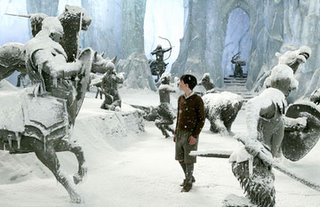
Read a biography of C.S. Lewis's life here.
See this movie if you haven't yet.
© Stephanie Lewis, 2005
Thursday, December 08, 2005
Monday, December 05, 2005
Postsecret
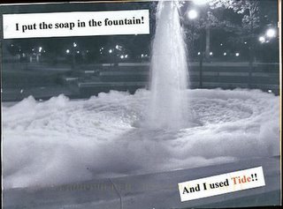
I added another link to my links at right. The site is called Postsecret. It's VERY interesting and sometimes moving and a site you can check again and again. Be forewarned: some of the language, information, and imagery may be objectionable to some.
Sunday, December 04, 2005
My Favorite Painting of ALL Time
(click picture to enlarge)
First, you have to know the story of Judith. Click here to read an article on her on wikipedia.org. Consider the size of the painting. It is life size. Imagine coming upon this image in the museum and your eye level is just about where Judith's hand that holds the sword is. Can you avoid feeling like you've stumbled onto a homicide in progress with the dramatic lighting and the blood red curtain in the background? Judith holds out her hand as if to tell her maidservant to be quiet or to block the light from revealing her face. There are a series of interlocking compositional diagonals of light and shadow as well as the position of the figures' limbs and drapery that simultaneously imply action and the nervous stability of being frozen where you stand. Holofernes is barely a "participant" in this composition. His lifeless head is all that is left of him and lies parallel to the horizontal bottom edge of the painting. Judith's maidservant is in the process of bagging or covering the man's head before someone catches the women. Both women are determined yet dispassionate.
The picture has a high degree of realism until you look closer. If the tiny flame on the candle is the only source of light, then it is putting out far more light than is actually physically possible. Also, the placement of the candle is confusing. Is it to Judith's right? Or is it in front of her? The placement of her left hand in relation to the candle creates confusing space in which the candle is both beside her and ahead of her, but the light on her hand indicates it should be straight ahead of her. One can only assume the artist used a second source of light based on these facts and the fact that more of a shadow should be cast by Judith onto her maidservant if the candle is the sole source of light. This slight tweak of space and light enhances the tension of the image. With these idiosyncrasies, this image has captured my attention for a long time with its dramatic lighting, its expression of time, and its dramatic subject matter.
© Stephanie Lewis, 2005
Friday, December 02, 2005
A Quote Comes to Mind

One of my favorite comedy films of all time is "Brain Candy" starring the Canadian comedy troupe Kids in the Hall. If you haven't seen it, you simply should. It's the story of these scientists who invent the cure for depression and the unfortunate side effect that ensues. The quote that comes to mind today is one that the character Mrs. Hurdicure (or "Patient 957") states after taking "the drug" for the first time. Upon being asked by the scientists how she feels, she states,
Now there's an image.

Monday, November 28, 2005
Review: Wicked, the Musical
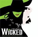 That's how the synopsis reads on the website for Wicked, the musical. And, like most synopses, it is woefully inadequate. The difficulty of writing a review or a synopsis is to avoid giving away too much of the plot so that people will still want to see it. This musical is about the origins of evil, what it means to be good, the mislabelling of people, tolerance, and of course, love and conflict.
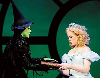
The story explores the lives of two women who came from different backgrounds. Galinda (later to become Glinda the Good) obviously comes
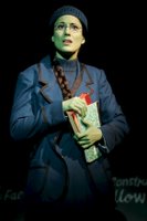 from a priveleged background and charmed life, while Elphaba is despised by her own father and others because she has had the unfortunate circumstance of being born emerald green. Galinda and Elphaba are assigned as roommates in college, and as anyone who's had that experience can attest, it's not always a good match. Galinda is a vaccous, shallow, but popular woman, and Elphaba is smart and sassy, and not at all into what Galinda is into. She has been made to be consciously aware of her limitations her whole life, while Galinda cuts a swathe easily through any room and gains the admiration and sympathy of her peers. Galinda has an inflated view of herself and has appointed herself Elphaba's savior. Elphaba participates in a cause to defend the animals who have been forbidden to speak or have opinions or freedoms out of her obvious identification with them.
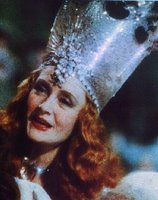
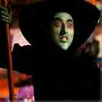 entertaining by the end of the film. There was always something likeable inside the character to me: that crazy laugh and hunched pose, the way she dramatically waved her fingers, her dark humor, and her habitat in the forbidden forest. I guess I saw her as more multi-dimensional than Glinda. Apparently, so did the writer of the story behind Wicked.
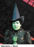
The performance we attended included actors Stephanie Block (Elphaba), understudy Emily Rozek (Galinda/Glinda), Derrick Williams (Fiyero), and David Garrison (the Wizard). Stephanie Block did a fantastic job playing Elphaba, but in my opinion, it was Emily Rozek that stole the show with her interpretation of the character of Glinda. I swear that I knew girls like that in college. She played Glinda in such a way that one could despise her, be annoyed by her, and still find her quite affable at the same time.

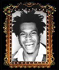
left: David Garrison; right: Derrick Williams
Finally, the set is magnificent in terms of construction, color scheme, and animatronics. Words simply aren't ample to describe the set. One spectacular part of the set is the talking giant, mechanical head of the Wizard. The costuming was a creative mix of Gay 90s attire mixed with derivations of the costuming from the original film. As a lover of the original film, I found it to be a tribute to the story, though I can see why some purists and those who prefer to believe in the polarity of good and evil would find it to be sub-par. Hopefully, most can put aside their preconceived notions and opinions and see Wicked as its own story.
* Lyrics can be found here.
© Stephanie Lewis, 2005
Sunday, November 27, 2005
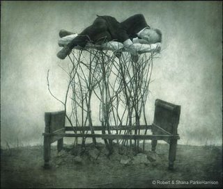
Robert & Shana Parke-Harrison
Girls' Night Out
The rest of the exhibition space was filled with work by two generations of female artists working today in an exhibition entitled Girls' Night Out. The work was primarily photography and video. One particularly good artist/filmmaker to me was Salla Tykkä, who was born in 1973 and lives in
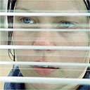 Helsinki. Her photographic stills were not as stiking as a film of hers that was included in the exhibition. The film was called Thriller, and read like a bizarre dream of a pre-pubescent girl. There is gazing in windows and gazing out of windows. There is a man searching for the girl, and in the end, leaving her alone in her bed. At one point, the girl finds a gun while chasing after the man, and shoots a sheep with it, while another girl burns brush outside the original house. The setting is a forested area after rain and on a cloudy day. Throughout the short film, the theme song from the movie Halloween is playing. Overall, the film is a disconcerting exploration of the themes of "coming of age," or "loss of image" from a clear, albeit surrealistic, feminine perspective. Here is an article on Salla Tykkä in The Guardian by Adrian Searle for further reading.
Wednesday, November 23, 2005
Cindy Sherman at the Contemporary Art Museum of St. Louis
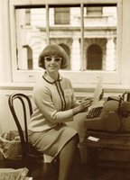
This coming Saturday, I get to see this exhibit. I'm very excited since I have NEVER seen a collection of multiple Cindy Sherman pieces in one place. To me, Cindy Sherman is to contemporary photography as Lon Chaney was to film. Her transformations of self are amazing, intriguing, and sometimes disturbing. She morphs so easily into the various identities women find themselves possessing or being possessed by. Look in future entries for my review of the exhibit. My boyfriend and I are also going to see the musical "Wicked" at the Fox Theatre and I will be reviewing that as well.
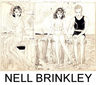
Why Have There Been No Great Women Comic-Book Artists?

I read this article the other day. The title naturally caught my eye. The author of the article seeks to understand why no women comic book artists have been featured in an exhibit called "Masters of American Comics" in Los Angeles. The exhibit will begin display this month at the Museum of Contemporary Art and the University of California's Hammer Museum.
The author of this article, Carly Berwick, explores three possibilities: Women not having the support, the overall role of women in the culture
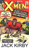 in the past, and the different tastes in the content of comics between men and women. Berwick cites writer Linda Nochlin in her essay, "Why Have There Been No Great Women Artists?" who says that "True female genius...had been curtailed by social conditions--the "overwhelming odds" against it--for want, as Virginia Woolf so succinctly put it, a room of one's own: a studio, some time, a helpmate, some ready admiration, all the factors that helped Pollock be Pollock and Picasso be Picasso." There is probably a great deal of truth to this statement. I know on a personal level, I have a supportive partner who u
 nderstands my non-reproductive creative urges and I have no children. A lot of women have children, not-so-supportive partners, and are often the caretakers of aged parents and parents-in-law (around 70% of caretakers of the aged are female). So, women have a lot of obligations often and have to meet the needs of a variety of people, traditionally. All this caretaking drains energy and art-making takes a lot of energy. And, perhaps, traditionally, the male "masters" saw female "masters" more as mistresses and those mistresses allowed themselves to be treated thusly.
The traditional roles of women began to change in the 1970s and women began to flood into the labor and creative markets. The roles listed in the preceding paragraph are now optional and women aren't as "trapped" as we perceived them to be in the past. Having children is optional and a woman is not labeled "barren." She can choose to have a partner or not and does not become an old maid, spinster, or
 pariah for choosing not to. A woman now has almost the same earning power as a single man (well, about 76 cents on the dollar) and can support her own art habit. Men are also experiencing a change in their mindsets about what it means to be a supportive partner. They are tossing aside the antiquated idea of the "king of the castle" that fathers and husbands had in the past and being more cooperative and contributing directly to the rearing of children in terms of personal interactions and not merely breadwinners.
In Berwick's article, New Yorker cartoonist Roz Chast states, "I think
 women--in general--like comics that are more verbal and personal and perhaps, more based in everyday experience." "Artbabe" and "La Perdida" creator Jessica Abel states that "Shoju, girls' manga, is structured like sitcoms....It's funny, light, and really appealing to a 12-year-old girl. That's all anybody was trying to get across all those years when people were discussing why girls weren't reading comics." Berwick also states, "the appeal of "male" comics to women--and of "women's" comics to male readers--was limited until
  the genre began to evolve beyond such distinctions, becoming more narrative and more focused on recognizable realities and emotions than on fantasies about spaceships and superheroes." The difference between men and women in terms of taste in content of comic books is an interesting justification for the lack of "master" female comic artists. Do women and girls really prefer "verbal," "personal," "sitcom-like," "narrative," and "realistic" content in their comics? Can that really be generalized? Why are male tastes considered the standard while female tastes are considered the deviation? Does this mean that men and boys prefer "stoic," "impersonal," "epic-like," "non-narrative," and more "fantastic" content? If so, why? Why do a lot of male created comics often include the theme of fantastic heroism?
These are all intriguing questions. To be sure, the answers are more complicated than "women have been kept down by men." What do you think? Why are women under-represented in the world of comics?
Friday, November 18, 2005
Robert Frost: The Road Not Taken (1915)
And sorry I could not travel both
And be one traveler, long I stood
And looked down one as far as I could
To where it bent in the undergrowth.
Then took the other, as just as fair,
And having perhaps the better claim,
Because it was grassy and wanted wear;
Though as for that the passing there
Had worn them really about the same.
And both that morning equally lay
In leaves no step had trodden black.
Oh, I kept the first for another day!
Yet knowing how way leads on to way,
I doubted if I should ever come back.
I shall be telling this with a sigh
Somewhere ages and ages hence:
Two roads diverged in a wood, and I--
I took the one less traveled by,
And that has made all the difference.
When I was in 7th or 8th grade in a little Lutheran grade school in Ellisville, Missouri (suburb of St. Louis), we had a pastor who taught us English literature. Fortunately, he was more than qualified and very passionate about the subject. He had us read some of the greatest short stories by O. Henry, Shirley Jackson, etc. He was a big fan of Hemingway (which I never really developed into-- I did enjoy "The Short, Happy Life of Francis MacComber," however). He had us read "The Old Man and the Sea." He had us memorize 600+ vocabulary words and their definitions one semester. The other thing he had us do was keep a poetry notebook. He exposed us to some of the greats: Carl Sandburg, e.e. cummings, Robert Frost, etc. Then, he had us write our own examples of various types of poetry (cinquain, limerick, sonnet, haiku, free verse, etc.) and illustrate our own bound book of OUR collected works, which I still have to this day.
We must have spent two weeks on the above poem. It made an indelible mark on my psyche to the extent that whenever I make major decisions, I can still hear it recited in my head. 'Convenience' and 'ease' are American watchwords for our culture and it seems to be embedded in everything we say or do, our choices for entertainment, how we acquire our material goods, and on and on and on. I am always refreshed when students go the extra mile or try something different on an assignment in my classes. It is ALWAYS rewarding for them as well as myself.
There have been several times in my life when I have chosen the road not taken (or less traveled by) and they have definitely been ways that lead on to ways. I'm glad I took the risks to choose art instead of psychology as the field of my career choice. I'm glad I chose a spontaneous road trip to Alaska instead of staying and working a 40-hour-a-week two weeks out of my summer in 1995. I'm glad I majored in painting in grad school with minimal experience at the time in painting and a background in drawing and printmaking. I'm glad I took the Arts Center job a few years back, even though I had never done anything like it. All of these were scary decisions and vast unknowns, but yielded extremely fruitful results.
I shall be telling this with a sigh
Somewhere ages and ages hence:
Two roads diverged in a wood, and I--
I took the one less traveled by,
And that has made all the difference.
Thursday, November 17, 2005
Me and You and Everyone We Know
The filmmaker, Miranda July, is a visual artist in her own right. On her site, mirandajuly.com, you can find interactive activities. One of the more interesting and fun pages is the "Learning to Love You More" page that provides the websurfer with "assignments" to complete and turn in which are then shared with the rest of the audience. These "assignments" have limitations and criteria. Some examples of "assignments" are as follows:
#50 Take a flash photo under your bed. Here is Rebecca Croft's photo:

#53 Give advice to yourself in the past. Here is Julia Henderson's response:
"Advice to Julia K.Henderson at age 10.
1. Math will never be your strong point. Ms.Bell knows you are smart, but stop worrying about what she thinks!
2. Concentrate on your art, it s beautiful.
3. Love the fact that you are a choir geek ! You love to sing and it s wonderful.
4. You have beautiful hair and flawless skin, stop worrying about being chubby. The cushioning will redistribute and be wonderful assets soon.
5. Relax a little. The world is not going to fall apart if you stop telling it what to do. Promise."
There are 51 more of these "assignments" and the results are fun to look at if you decide not to participate. Some are even potentially therapeutic if you do decide to participate.
© Stephanie Lewis, 2005
Wednesday, November 16, 2005
I'm Glad my Childhood is Not on Video
I stumbled onto this gem this morning. The question is, do you think that THEY or this guy will be potentially more embarrassed in the future? The other question is, why did they choose an 80s dance repertoire for their medley? Another scary thing is that my childhood music is now considered "classic" or "oldies." It had to happen eventually.
Tuesday, November 15, 2005
My Trip to Chi-Town
Once I got my rental car, I was reminded anew how similar the Chicago highway system is similar to St. Louis's (my hometown). So, Chicago is always somewhat familiar to me even though I don't spend much time there.
 Upon arrival, I was greeted by my cousin's wife and four year old daughter. She calls me "Aunt Steph" even though we are really second cousins--because her dad is really like a brother to me. However, she didn't recognize me right away--four year old memories being what they are. Later that afternoon at the dinner table, she leaned in and said, "So. My dad says that your a good artist." I said, "Hey! I thought you didn't know who I was!" She laughed. I said, "Some think so." She said, "My grandpa's a good
 artist too." This brief discussion was basically par for the course between me and Maddie during this trip. We spent loads of time playing pretend games and drawing too. It was also the first time I met my new little cousin Kayla.
I drove downtown the day of the reception and arrived about 3 hours before the event so I could wander around. I first went to find the gallery, and when I got there, I took photos of the art on the walls while the room was empty. After leaving the gallery, I found this novelty and poster store and spent most of my time there, killing time. Then, I grabbed a bite to eat a few blocks away from the gallery. I had this strange waiter who kept looking at me like he knew me--or at least like I had another eye in the middle of my forehead. It was rather strange. I asked if there were any discarded papers and he brought me one, so I parused that and tried the crossword.
It was about 15 minutes until five when I walked down to the gallery. People were already there, even though the snacks and drinks weren't ready yet. I immediately met with Karen Egerer, the organizer of the event/exhibition through Heartland International. Karen introduced me to Michael Ensdorf, the Director of the Gage Gallery at Roosevelt University, and Gregory G. Knight, the Director of Visual Arts at the Chicago Department of Cultural Affairs, and Chief Curator of Exhibitions at the Chicago Cultural Center. Susan Aurinko, Director of FLATFILE Galleries and also the third juror, was unable to attend.
 I spent some time talking about my piece with Michael. He had an interesting interpretation on it. Interesting, not because I can't see his point, but because I didn't really have the particular issue in mind when I made the image. We talked about how the multiplicity of interpretations is an asset and not a liability and opens dialogue. As the evening progressed, I found out that not only did we have similar jobs, but also similar philosophies--just in two different places in the country.
As the evening progressed, I met artists who were in the exhibition with me as well as other
 artists who often engaged in some conspicous self-marketing. I admired their moxy and walked away with several of their cards. I spent most of the evening talking to a financial planner from Mass Mutual, of all places. He had some intriguing ideas about politics and was planning to write a novel at some time in the future. He and I also chatted at length with one of the other artists and her daughter about the state of the world and politics.
After the reception was over, Michael invited me to go to dinner with he and his wife's friends at the Park Cafe. We all had great philosophical discussions about art, education, creativity, motivation and all the other deep things artists, arts educators, and arts administrators talk about when they are together. The ambience of the restaurant was also very nice and the food was nearly perfect. After dinner, Michael made sure I made it safely to my car in the parking garage and I dropped him off at his car.
 The rest of the time I was in Chicago, I went to Ikea with my cousin-in-law and we had lunch. I had Swedish meatballs for the first time in forever. We wandered the store for the afternoon and I thoroughly enjoyed all the efficient Swedish (and Scandinavian, to be honest) domestic engineering. That evening we had some yummy pizza and I spent some time with my cousin.
The next afternoon, I flew back to Arkansas.
Here are some artists who presented me with their cards:
Roland Kulla
Andrea Harris
Andrea Harris also promoted BettyAnn Mocek.
Renee McGinnis
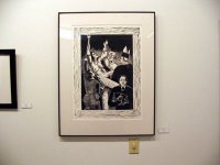
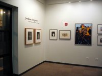
Finally, here are some images from the gallery:
